We have given you our verdict on all 20 Premier League home kits for the upcoming season, so now it is time to look at what teams will be wearing on the road.
- If you have not seen our home kit rankings, go ahead and open them up in a new tab here.
New strips always cause debates, with retro-inspired numbers proving popular among today's football supporters.
Premier League clubs have been donning their kits in pre-season and some of them look real classy. Some, not so much...
The away strips have actually been a much better standard overall, so it took some whittling down as we ranked them from the worst to best.
See if you agree and, of course, it is subjective so let us know your thoughts by tweeting @SportingLifeFC or @GeorgePitts_...
20. Newcastle United
TBC
There were rumours the Magpies would be unveiling their new away shirt with the confirmation of Joelinton's club-record capture, but the Brazilian was announced on Tuesday evening and there is still no sign of it.
So, until then, they occupy bottom spot - fans will be hoping the trend does not continue in the new season.
=20. Watford
TBC
18. AFC Bournemouth
The Cherries are also yet to release their away strip, but the fact they have a third one already out means they get a place on Newcastle and Watford.
Here it is, fluorescent yellow:
Roll that funky house music... 🎶
— AFC Bournemouth (@afcbournemouth) July 8, 2019
Here's a closer look at our new @UmbroUK third kit - and it's available to buy right now!
🛍️: https://t.co/kt58LdIFAP#afcb 🍒 pic.twitter.com/7tbMlxtmbB
17. Southampton

Another low kit ranking for Southampton.
It is a slight improvement on their home strip but the mixture of grey, yellow and a big blue sponsor does not look too great.
16. Crystal Palace

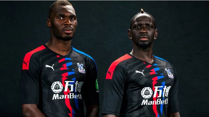
There is nothing massively wrong with Palace's away shirt to be honest, others are just better, although it is odd they still have flashes of red and blue considering it should differ from their home kit. The faint, wavy pattern is subtle and looks quite nice though.
Throwing back to previous seasons, the club said in the unveiling: 'The return of the black away kit draws memories of recent Premier League campaigns with the 2013/14 and 2017/18 seasons seeing the Eagles don the black colours when away from SE25.
'Here's hoping the new, slick away kit results in more moments such as Dwight Gayle’s injury time winner away at Villa Park on Boxing Day in 2013 and Roy Hodgson’s half time tactical masterclass away at St Mary’s in January 2018.'
15. Sheffield United

A pretty plain effort from Sheffield United when on the road in their first season back in the top flight, with a v-neck on the away and round neck on home.
The huge sponsor spoils it a little though.
14. Brighton and Hove Albion

Pretty simple but pretty slick from the Seagulls as they opt for all black with white for the logos and sponsor. Nice.
13. Aston Villa

There is something about this Villa kit which is appealing. Maybe it is the slightly silky-looking material or the slight retro look, Kappa have done a good job.
The likes of Everton and Chelsea paid homage to Goodison Park and Stamford Bridge respectively with their home shirts and Villa will take a piece of home with them on the road as their away top features the 'famous Villa gates across the body'. The faint white pattern on the front is nice too.
12. West Ham

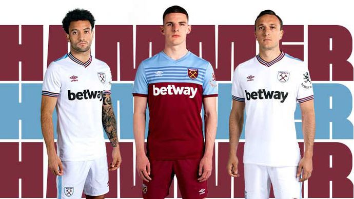
A pretty plain white one from West Ham, but a little retro and that always goes down well in the Sporting Life office.
The plain badge and claret stripes on the collar and sleeves go well to make a pretty cool strip to wear on the road.
11. Burnley

Burnley's home strip is remarkably similar to Aston Villa's - granted, there is not a lot that can be done with claret and blue - and their away strip is pretty alike with the same shade of blue.
The claret pattern on the front of Burnley's looks nice though and scores them a couple of extra places.
10. Everton

The Toffees' home shirt paid homage to their old Goodison features and you will certainly not miss them on the road in this bright orange away top.
The subtle diagonal stripes and navy collar goes well, we just hope it is not as bright on the field as it may look initially.
9. Norwich City

Norwich have had some pretty awful away shirts in recent years, sticking with variations of green and yellow, but this time they have gone for red as their primary colour for the first time since 2007/08 and Errea have produced them a different jersey, but a decent one.
Yellow and red seems a random combination but the pattern across the shoulder works - although this one really did divide opinion in the Sporting Life office.
8. Wolves

A nice black and orange combo with diagonal lines looks pretty smart as Wolves [hope to] embark on a European tour.
Although the main sponsor is different from this one worn in pre-season, it looks pretty tidy and enough to get Wanderers into the top 10.
7. Leicester City

The Foxes have two away shirts without specifying which is away and which is their third.
One is pretty nice, but just plain black, so we have thrown in their pink version which should look good on the road.
It is very similar to Germany's 2018 World Cup kit, with an identical pattern across the shirt, but that would be because it is from the same makers. Foxes fans will be hoping for better fortunes than the Germans had in this shirt.
All in all, Adidas have done a pretty good with all of Leicester's strips this term.
6. Tottenham

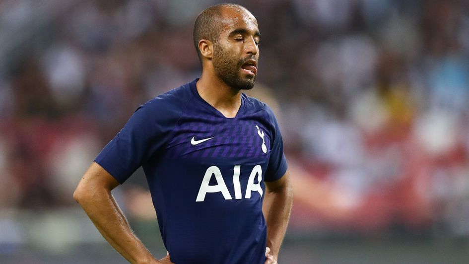
Spurs have gone very similar to their 2017/18 away kit but, when it is so similar but so nice, why not.
They have gone for a nice shade of navy blue, stuck with one secondary colour and the three-lettered sponsor is not intrusive.
5. Manchester United

A much better score than their home ranking, United's away kit is not bad at all.
They have gone for the unusual 'savannah-toned' shade with a snakeskin pattern and it actually works quite well to incorporate the sponsor, as opposed to the home kit.
Discussing the design and the inspiration of the city, the kit press release says:
'The striking new away shirt continues to blur the lines between sport and style, blending both cultures in to a single piece of design, which will of course be seen during our away trips in 2019/20. Influenced by the unique artwork of the Northern Quarter, the city is embedded deep within the design as the base colour is overlaid with a subtle pattern.'
Fairplay. Now can they walk the walk?
4. Manchester City

United's was inspired by the Northern Quarter, City's inspired by the former nightclub Hacienda for their first shirt in their new partnership.
Their home kit draws inspiration from 'Manchester's industrial heritage' whereas the away kit celebrates the 'Madchester' years.
City's description says: 'Using black colour as a base, this Away kit features yellow stripes on the left shoulder: a reference to The Haçienda’s iconic graphic identity. Additional peach and City blue pops create a colourful representation of this legendary cultural icon that was the heartbeat of the city.'
A nice plain black with added colour but different. In a nice way.
3. Liverpool

Simple but delightful from Liverpool with their all white away strip.
With a simple black secondary colour and hint of red on the sleeves, Jurgen Klopp's side will look the part away from Anfield in 2019/20 as they look to go one better than last season. It's a neat top.
2. Chelsea

Another simple white strip, the collar on Chelsea's away strip takes it to another level and this top looks the business.
The sleeves and collar also have red and blue-striped trim on to give it a very aesthetically pleasing finish. It would be no surprise if this proves popular with the club's fans.
1. Arsenal

Another victory for Arsenal!
For the first time in a while, the Gunners seal the double - just named by Sporting Life as the owners of the best home and away kits in the Premier League next season.
After going to Adidas, the north Londoners' tops are very smart and very retro. The away one is influenced by the 91-93 ‘bruised banana’ and looks just brilliant.
The club say of the kit:
'The design features a modern twist on the historic ‘bruised banana’ graphic. A minimal, shaded zig-zag pattern adorns the famous bright yellow of the Arsenal away shirt. The revived and redesigned kit for this season, previously a symbol of the adidas and Arsenal partnership, brings the past into the present with this bold new design.
'This kit features a modern, navy crew neck collar with colour-matched navy adidas stripes on the shoulders and logo. The navy detailing matches the navy used in the 1991-3 design graphic, a subtle nod to an old era brought into the future.'
Unai Emery will be hoping it can inspire his current crop in the coming campaign.


