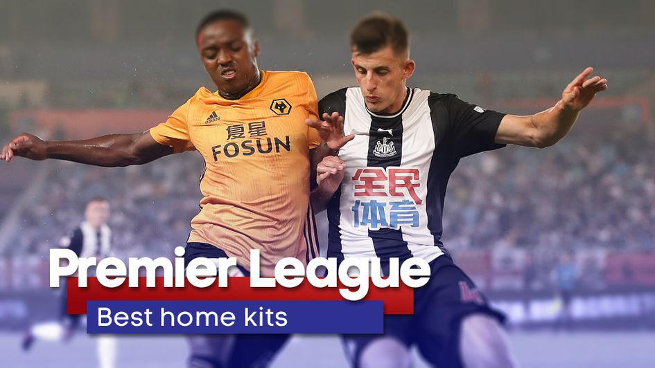
It is the great time of year where the start of the football season is around the corner and the new kits are filling up our social feeds.
New strips always cause debates, with retro-inspired numbers proving popular among today's football supporters.
Premier League clubs have been donning their kits in pre-season and some of them look real classy. Some, not so much...
After numerous disagreements in the Sporting Life office, we have compiled every home kit in the top flight this season, ranking them from the worst to best. See if you agree...
20. Southampton

Yes, Southampton have had some nice kits in previous years. Some great kits. But not so much this one...
They have reverted to wider stripes this year, away from the tidy narrow ones of recent campaigns.
This had the potential to be great, but the big splash of black around the shoulder and top of the chest ruins it completely.
Our office after seeing the new Southampton home kit 😬#SaintsFC pic.twitter.com/JbqCYjpajo
— Sporting Life Football (@SportingLifeFC) May 17, 2019
19. West Ham
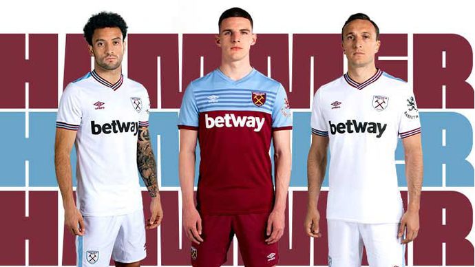
The famous claret and blue of West Ham has combined well to make some great shirts in previous years, but this will not go down as one of them in our book.
Fans actually quite like it, but hate the fact it has claret shorts as opposed to white.
Not a huge fan of the blue on the upper body. As one fan on Twitter says: 'It looks like someone stitched the away top with the home one.' Spot on.
18. Sheffield United

Adidas put together a tidy little shirt here for Sheffield United's return to the top flight but a theme in this ranking is how sponsors spoil the front of the strip and the huge logo here is a bit of an eyesore, not helped by the fact part of it is red like half of the strip.
The Blades' strips do not seem to change much year after year and this one fails to inspire the neutral.
17. Burnley
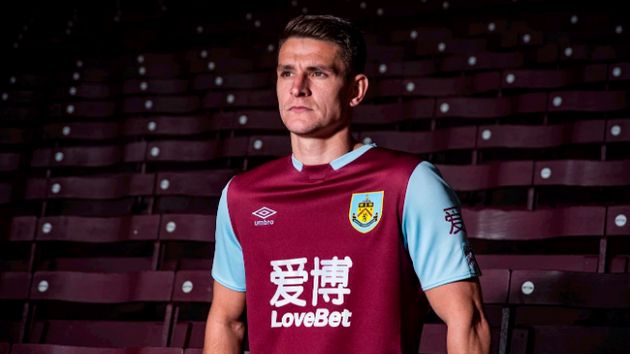
A standard claret and blue number from Burnley, dominated by a huge sponsor emblazoned across the midriff.
The club's kit press release says it 'features a stylized rib-crew neckline, with sky blue sleeves and contrast claret shattered diamond print and panel to sleeves.'
It's just a bit meh, to be honest.
16. Aston Villa

It would be harsh on Burnley if this kit was placed any higher, considering they are pretty similar.
The Kappa version just looks slightly cleaner which gets it a place higher in this ranking.
15. Brighton and Hove Albion

Brighton's kits have been pretty similar in recent years.
The difference here from last season's seems to be slightly more stripes, a yellow Nike tick instead of red and blue sleeves as opposed to white.
It is described on the club's website as: 'A distorted take on Albion’s traditional blue and white stripes.'
Last season's was probably slightly better to be honest - fans will be hoping the backwards trend does not continue on the pitch.
14. Manchester United

The Red Devils' new strip marks the anniversary of their famous treble-winning season under Sir Alex Ferguson.
Their kit release says: 'It pays homage to the incredible 1998/1999 season in which United made history by becoming the first team to win the Premier League, FA Cup and UEFA Champions League in one season. Twenty years on, it remains a unique achievement – unmatched by any other English club.
'The new shirt acknowledges the minutes in which those historic goals were scored with 90+1 and 90+3 printed on the sleeves. The dates of the FA Cup final win over Newcastle United and decisive Premier League match against Tottenham Hotspur are also displayed, along the bottom of the shirt.'
A good idea but it is ruined by the huge Chevrolet sponsor in the middle. The shade of red looks slightly better than the previous years but it would have made more sense to do a commemoration to their famous triumph last season, but maybe it is because that would have clashed with their 'Railway Men of Newton Heath' inspired top.
Since Sir Alex left the club, they have been guilty of looking back and that seems to be what is happening here. Let's see if it inspires Ole Gunnar Solskjaer's men on the pitch.
13. Newcastle

A kit with so much potential to be a contender on this list but the sponsorship is a bit of an eyesore on the front.
The fact it is blue and not in black and white to match the kit is great for the sponsor, but not so pleasing on the eye. It certainly takes away from an overall smart strip.
12. Everton
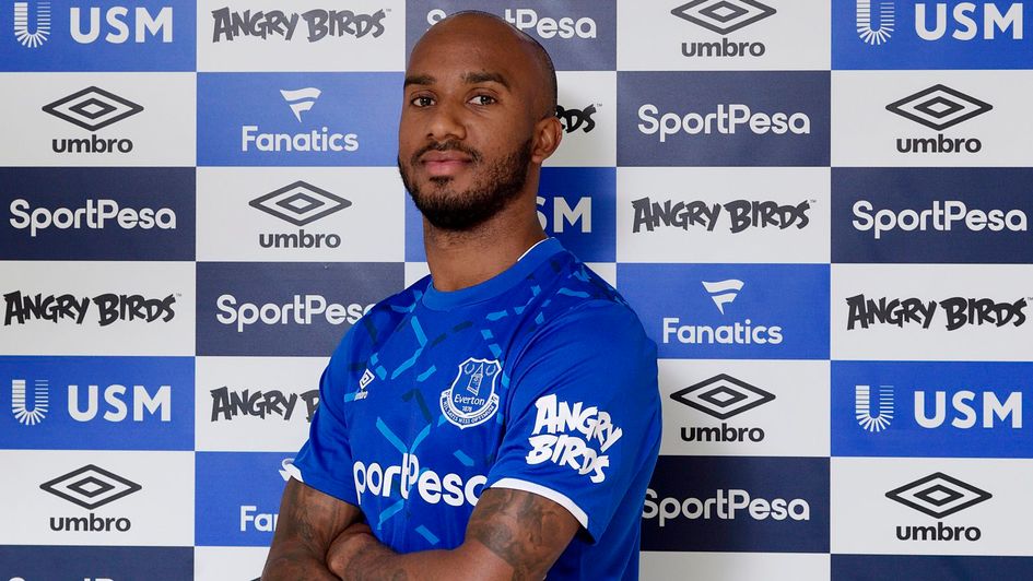
A lovely shade of blue with a pattern inspired by the Goodison Park steel work.
You can see what they are trying but the pattern looks a bit random across the front on the shirt. Otherwise it is not much different to last season's.
11. Chelsea

'This year, our new kit takes its inspiration from Stamford Bridge, so no matter where you’re following us from around the world, the shirt brings us all together' - That's what the marketing lingo says on the website.
This, like Everton, also looks like an odd pattern chucked on last season's shirt.
10. Tottenham

A very neat shirt from Tottenham for their first full season in their new stadium.
But is it really much different to last season's? Nope. Smart nevertheless for Mauricio Pochettino's men.
9. Manchester City

A tidy sky blue shirt for the Premier League champions to wear.
Not convinced by the purple strip on their shoulders though and that is why it only just makes the top 10.
8. Liverpool

A fairly plain pinstripe kit from the Champions League winners with a splash of yellow on their make and club crest in dedication to legendary manager Bob Paisley and the shirt from their 1982/83 league title-winning campaign.
Jurgen Klopp will be hoping to replicate that success in the Premier League. It looks good and sees them return from the collar last season to a round neck which works well. A great tribute to a great side.
7. Crystal Palace

Like Tottenham's, Palace's kit looks pretty similar to the last few seasons but it must be hard for them to get a variation on red and blue stripes every year.
Some teams have gone for wider or thinner stripes this season, but Palace look to have got it right. This one looks slick.
6. Norwich

The Premier League newcomers have a distinct yellow strip each year and they have changed it up nicely with the green fade on the lower half of the shirt.
After feedback from fans, the Canaries have gone back to a stitched club crest and it is a fitting strip for their return to the top flight.
5. AFC Bournemouth

Even though the sponsor is a little on the larger side, this is a slick effort from Bournemouth.
The primary red looks good and it fits nicely. A great job by Umbro on a red and black striped shirt that could be difficult to mix up.
4. Leicester City

Leicester rarely make big changes to their kits, but the subtle chequered pattern on the shirt makes it pretty easy on the eye and worthy of a top four finish on our kit rankings.
Brendan Rodgers' side will look the business as they look to break into the top six of the Premier League.
3. Wolves

Simple, but effective from Wolves. The distinctive orange kit is slick and will look great in the Europa League, should they qualify for the group stages of course.
2. Watford

A lovely, slick effort from Watford and a kit that is incredibly unlucky to not make it to number one.
They usually go predominantly yellow but the black half-and-half combination looks fantastic. Adidas have done a great job here for the FA Cup finalists, an improvement on last season's and a huge jump from their home one in 2017/18.
Javi Gracia's men will certainly look smart when lining up at Vicarage Road.
1. Arsenal
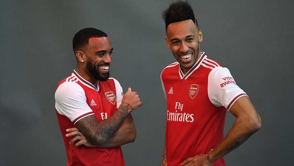
After replacing Puma at Arsenal, Adidas have produced a superb effort.
The retro design looks stylish and Gunners fans will be hoping Alexandre Lacazette, Pierre-Emerick Aubameyang and co can live up to the billing by having a successful second campaign under Unai Emery.
Subtle changes, the three stripes on the shoulder, an old school look, it is no wonder this has proved popular with fans in north London.
Premier League 19/20 away kits: Worst to first
Ranking the best and worst of the new away kits for 2019/20 - click the image below to have a read...


